Firefox’s Stylish plugin rocks January 7, 2007 at 7:58 pm
[ Watching:

“Titus – Seasons 1 & 2” (Kevin Sullivan, Howard Murray, Michael Lessac, Robert Berlinger) ]
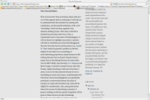
I read a lot of blogs, and I find that a lot of them seem to think it’s cool to use really narrow columns to display their text… I guess they want to appear like a newspaper or something. While it’s not a big deal reading text like that in a newspaper, I find it extremely annoying annoying when reading websites. This wouldn’t be a big deal if the site admins would set widths with percentages so that the text resizes with the window size, but too many of them use hard-coded pixel sizes instead. Here’s an example of a recent site I visited that was just way too damn narrow.
No matter how wide you make your browser, the text stays as it is. Make the fonts bigger and it gets worse… less and less words on each line.
So I found and installed the Stylish add-on and gave it a shot. Does exactly what I want. Only thing that sucks is you need to check the source of the page and set overrides for the css tags the site uses, but it works.
Here’s the same site with the overrides I did:
Much, much easier to read. The overrides I wrote look like:
@-moz-document domain(thesitesdomain.com) {
#outer-wrapper { width: 95% ! important; }
#main-wrapper { width: 80% ! important; }
}
Man I love Firefox and how extensible it is.
BTW, if you happen to recognize this as your site… take the advice, change your lame, narrow columns into something easier to read.


